Scrollytelling
Create cinematic animated sequences driven by page scrolling. This guide explains the properties panel features step-by-step to help you configure your desired effect, with practical examples to master every single function.
1. Resources and Primary Assets
Connect your image sequence and define supporting graphic files to ensure smooth navigation.
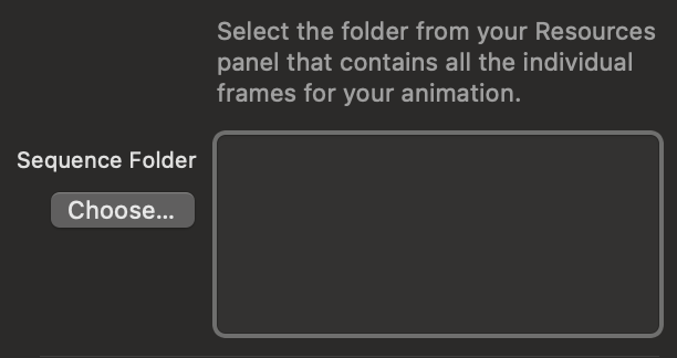
Sequence Folder
Select the folder from your Resources panel that contains all the individual frames of your animation ordered numerically. Make sure the files are compressed to keep the animation smooth on the web.
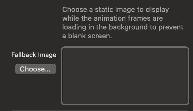
Fallback Image (Poster)
This static image is instantly shown to the user while the animation frames load in the background, preventing a blank screen.
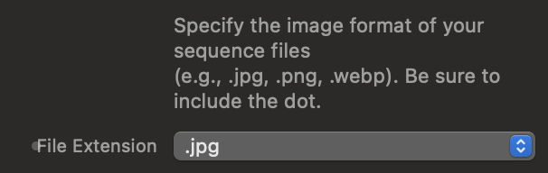
File Extension
Specify the exact format of the images that make up your sequence (e.g., .jpg, .webp, .png).
2. Sequence Settings & Nomenclature
Align the component's internal math with how you exported the files from your animation software.
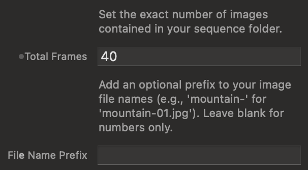
File Count and Prefixes
Tell the component how many total frames make up the animation and if your files have a text prefix before the number.
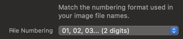
Numbering Format (Leading Zeros)
Match the numbering digit length to that of your actual files so the code knows how to look them up.
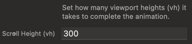
Scroll Duration (Height in vh)
Control the scroll space required to complete the entire sequence, expressed in vh (Viewport Height).
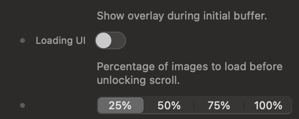
3. Loading Indicators (Invisible Buffer)
Control the user's waiting experience by blocking interaction until a safety threshold is loaded.
Activation and Unlock Threshold
Select how much of the animation must be downloaded in advance before removing the loading screen and allowing scrolling.
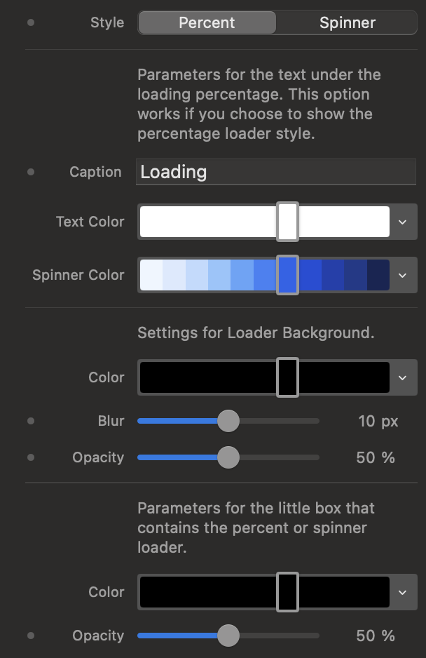
Loading Style
Choose between a percentage indicator or a circular spinner, and customize the background overlay.
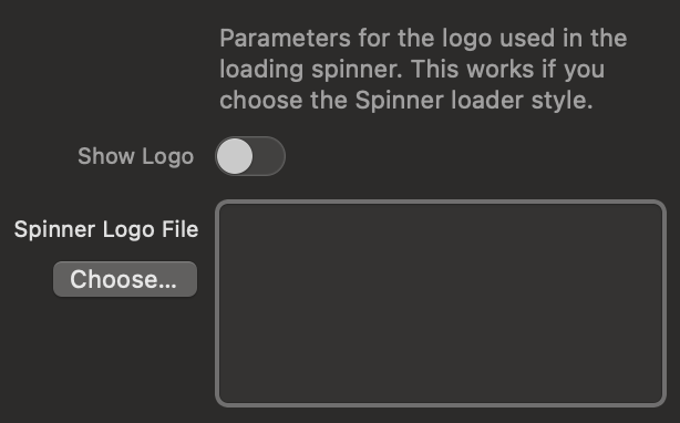
Logo in Spinner
Upload and display your brand logo perfectly centered within the circular loading animation.
4. Trigger Points (Scroll Triggers)
Define the exact intersection between the monitor and the component where the magic should start.
Viewport and Container Management
The Viewport is the user's screen. The Container is the box holding your image sequence.
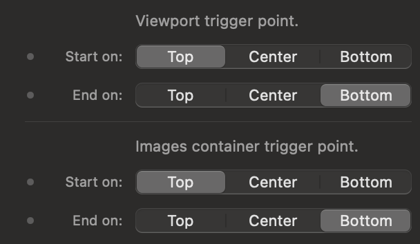
Interactive Trigger Simulator
Use the control panel on the left to simulate the settings in Elements. See the live result in the browser window on the right. Blue lines control when the animation starts, Red lines control when it ends.
5. Container Style and Overlaps
Modify the spatial interaction of the sequence with the rest of the page elements.
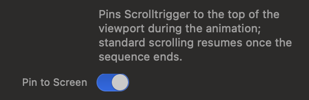
Pin to Screen
The core feature of Scrollytelling. When activated, the container remains fixed in the center of the screen while the user scrolls.
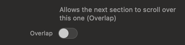
Overlap Effect
Subverts the normal page flow, allowing the next section of your webpage to visually scroll over the animation once it's finished.
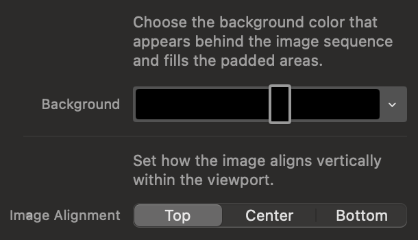
Background and Image Alignment
Define the fill color for empty areas of the container and anchor the image sequence vertically.
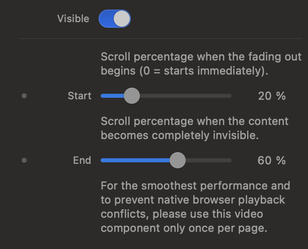
6. Fades and HUD
Add graphic gradients and indicators to visually integrate the component and guide your users.
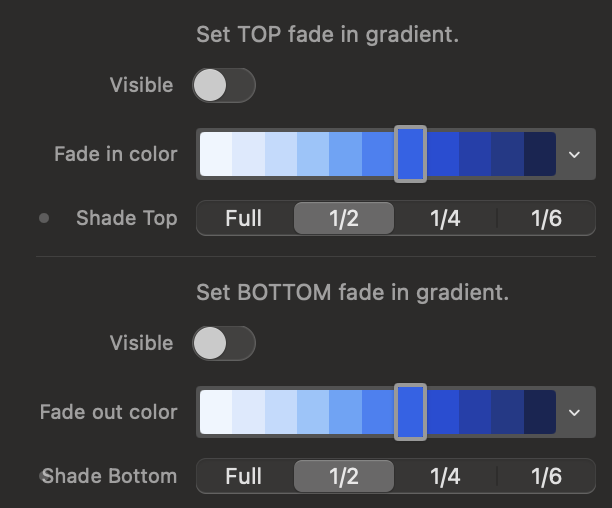
Fade In/Out Gradients
Apply overlapping gradients to the top or bottom of the canvas to hide sharp cuts.
Scroll Hint Indicator (HUD)
Enable an area at the bottom to insert text or icons to suggest scrolling behavior.