Lumière Title
Create cinematic interactive titles driven by scroll. This guide takes you step-by-step through configuring the properties panel, helping you master every visual effect and animation mechanic with practical examples.
1. Text, Typography, and Layout
Define the structural appearance of your title before applying the visual magic.
Formatting and HTML Tags
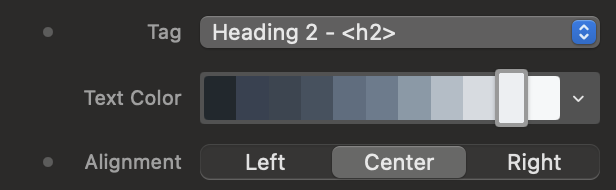
Choose the appropriate HTML tag for SEO, set the base color, and define the text alignment. The rich text editor allows you to input the actual content of the title.
Advanced Typographic Control
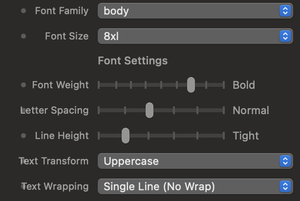
Adjust the font, weight (Font Weight), letter spacing (Letter Spacing), and line height to give your text character.
Global Sizing
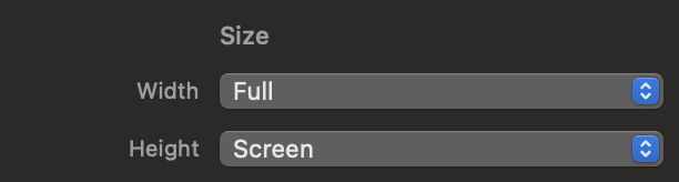
Determine how much space the animation container should occupy within your webpage.
2. The Catalog of 10 Cinematic Effects (Live Preview)
Drag the Lumière Title component into the dedicated areas to test the visual behavior of each preset style in real-time.
01. Epic Zoom
The title undergoes a progressive, majestic, and three-dimensional enlargement, advancing in a smooth scale towards the user's screen without ever losing quality.
02. Anamorphic Flare
A horizontal line of light crosses the center of the screen, expanding to simulate the reflections of anamorphic cinematic lenses, while the text gently emerges from a slight blur.
03. Golden 3D
The text block rises from the bottom, rotating along the X-axis with a deep 3D perspective of 800px, straightening up until it becomes flat and readable.
04. Cyber Glitch
The text instantly breaks down into three misaligned chromatic layers (RGB Split) at high speed, accompanied by an outer graphic outline and distortions typical of corrupted digital video signals.
05. Ghostly Mist
The title slowly materializes in front of the user, emerging from a dense 20-pixel Gaussian blur, gradually reassembling as the scroll progresses.
06. Magma Burn
A high-energy effect. The text starts dark, suddenly explodes in a blinding glare with a strong lateral skew, and finally stabilizes, reabsorbing the heat with an elastic bounce.
07. Noir Chrome
A sophisticated cinematic combination: the title is projected at an increased scale (1.5x) and heavily blurred, then gently shrinks and clarifies down to its native form.
08. Neon Night
The title plunges into the screen rotating slightly and instantly activates an intermittent multicolored neon backlight, simulating the realistic flicker of a vintage gas tube.
09. Space Parallax
The text is literally "disassembled" character by character. During the scroll, each single letter rotates individually on the Y-axis coming from the depth of 3D space and aligning with an elegant cascading delay (stagger).
10. Minimal Impact
The text is revealed through an invisible geometric mask (clip-path). Initially confined in a very thin horizontal slit in the center, the title opens by expanding vertically like a real theater curtain.
3. Animation Direction (Scrub vs Smooth)
The core of the component: decide whether the animation is driven millimeter by millimeter by the mouse or if it triggers automatically.
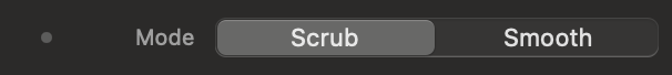
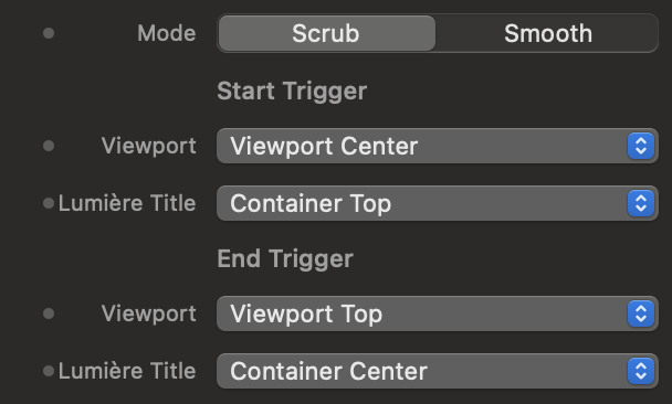
Animation Mode (Anim Mode)
Choose between Scrub (the animation moves back and forth physically tied to the speed of the user's scrolling) and Smooth (the animation starts smoothly and completes itself at its preset speed as soon as the text enters the active area).
Trigger Behavior (Smooth Trigger)
An option dedicated to Smooth mode: set whether the animation should happen only once ("Once"), repeat every time you re-enter from above ("Always"), or rewind in reverse when the text leaves the screen ("Enter and Exit").
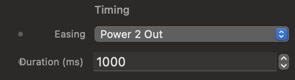
Dynamics and Timing (Easing and Duration)
Control the mathematical acceleration curve (the elasticity or linearity of the movement) and how many milliseconds the total development of the visual effect should last in automatic mode.
4. Anchor Points and Advanced Options
Define the exact intersection between the monitor screen and the component, and add classy touches to the pinning.
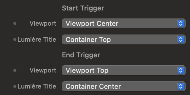
Viewport and Lumière Title (Start & End)
Plan the "scroll direction" by setting the mathematical contact points. The Viewport represents the user's physical screen, while the Lumière Title corresponds to the invisible perimeter of the component.
Interactive Trigger Simulator
Use the control panel on the left to simulate the settings in Elements. See the live result in the browser window on the right. Blue lines control when the animation starts, Red lines control when it ends.

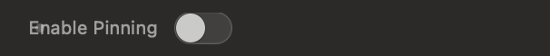
Pin to Screen (Enable Pinning)
Exclusive to Scrub mode. If activated, it temporarily blocks the vertical descent of the webpage, forcing the monitor to remain fixed while the mouse movement consumes the typographic animation.
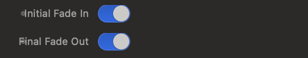
Entry and Exit Fades (Fade In / Out)
Apply dynamic opacity transitions at the beginning or end of the effect's scroll to avoid abrupt visual breaks or sharp cuts on the edges of the screen.